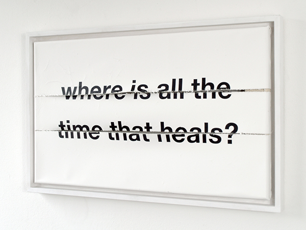
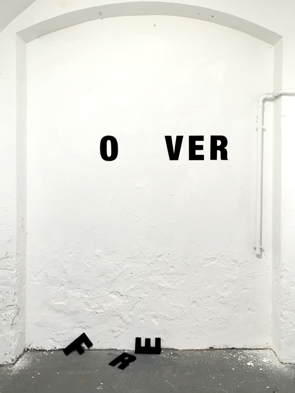
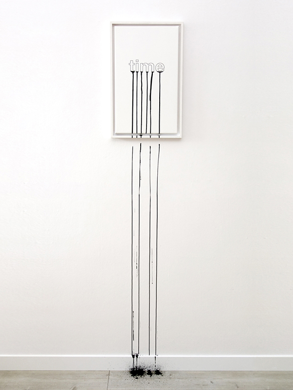
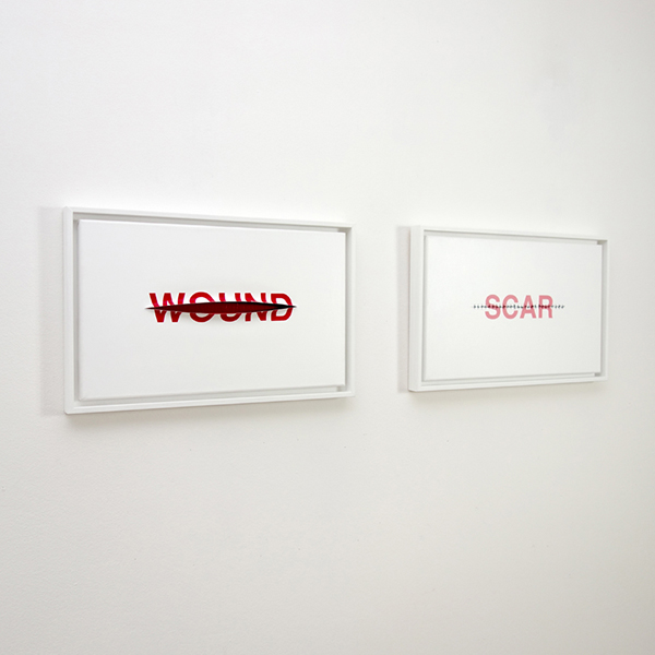
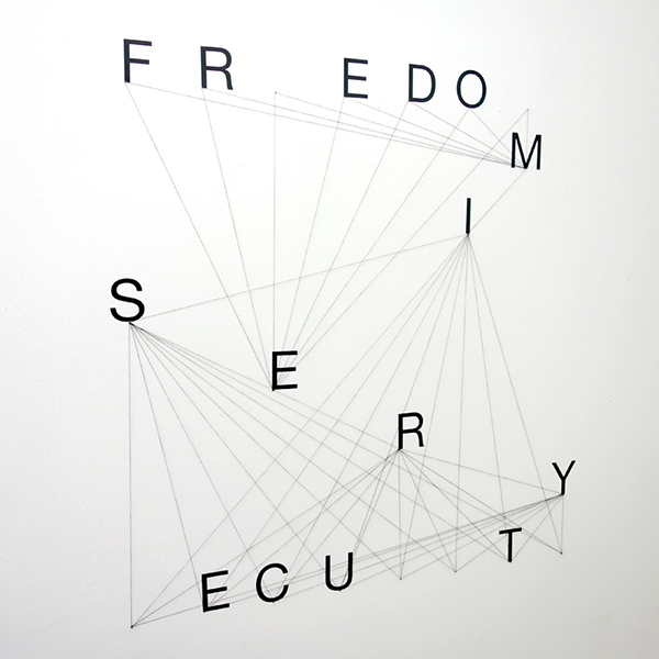
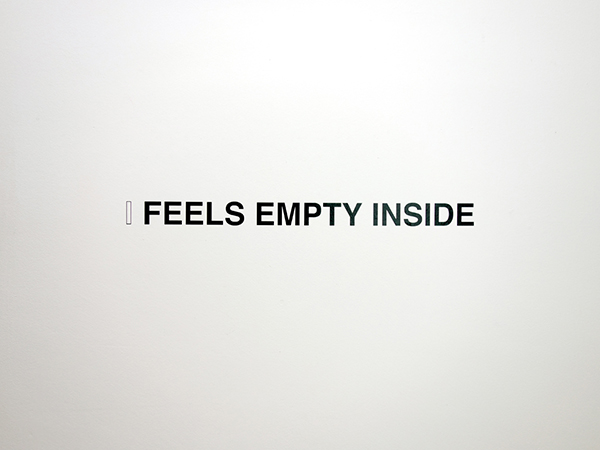
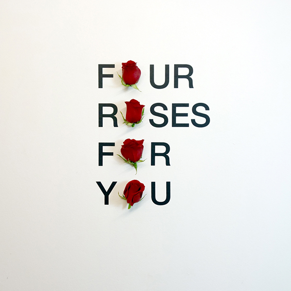
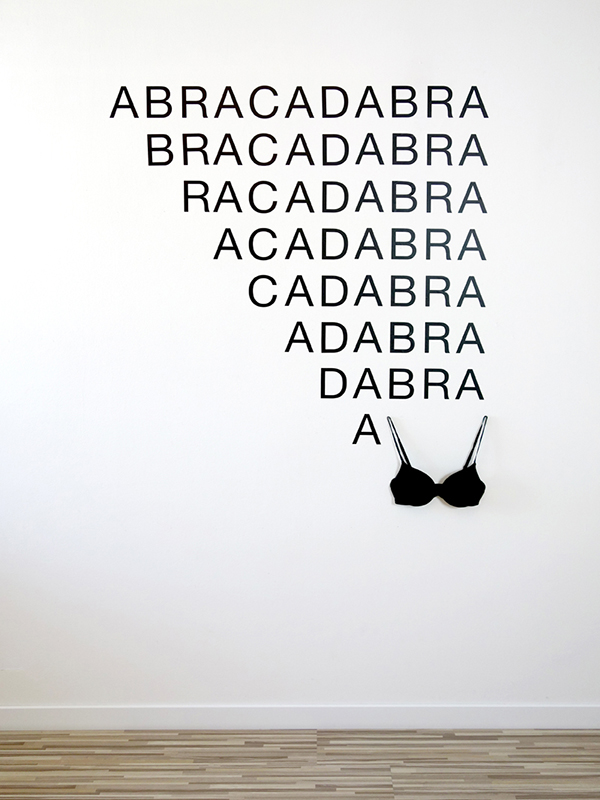
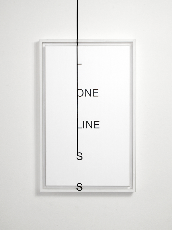
His works bring a smile after we see it, and also plays with our minds, because we notice a hidden truth behind it, which makes us think on how genially artist Anatol Knotek creates the visual poetry that reflects our everyday life. Anatol explains to us about his works, and how he became interested in this kind of style of art, which was inspired after one trip he had. Read more about the minimalistic, concentrated work, telling something aesthetically pleasing.
As an artist your story is related to the visual art sphere. How did you found your path in this kind of art form?
My interest in visual poetry arouses relatively late, about 15 years ago. In my youth, I mainly painted and I was more interested in fine arts than in literature. Subsequently, I started with text collages and concrete poetry. After meeting the Austrian poet Peter Daniel, and a trip to Jürgen Blum and his open book (concrete poetry on more than 100 house facades) in Hünfeld (Germany), I realized the great fascination of visual poetry. From then on I worked primarily in that field and began, still strongly oriented to the visual language of figurative painting, to write images. From that point on, it was and still is an ongoing journey with a lot of influences from other artists (Ernst Jandl, Kay Rosen, Timm Ulrich, Micah Lexier, Peter Downsbrough) and art forms as conceptual art, text-based art etc.
What is the biggest challenge in creating your type of works?
Visual poetry can only be understood when reading and looking at it – that’s one part of the challenge, but the biggest challenge for me is that my work should speak to and touch people from a visual and intellectual point. But when using words (mostly one word only) and puns as the center of your art, the trap is that the message can soon become shallow, clichéd or corny, and of course this is something I want to avoid completely. Ideally, my work is minimalistic on the one hand and concentrated on the other hand, but I can still say something and it is aesthetically pleasing.
Your work is called usually visual poetry. What is the goal with every project that you are doing? What kind of message you are trying to show to your viewers?
This totally depends on the word/project. The message evolves from the text that is used and not the other way around. I see it as part of my work, to release another or possible extra meaning of words with the support of different dimensions. The nature of literature is descriptive and the nature of the image is sensual – that gives a lot of room to experiment with expression. I play with the thought that the same word can mean completely different things – and when that is the case, there is tension there is insecurity, fragility and what was strong and certain before, becomes uncertain and hard to comprehend. That’s fascinating to me. …and if there is truth or reality, isn’t it revealed best in contradiction? The meaning of art is in some parts to destruct and reconstruct again. It’s always the tension between harmony and disharmony. The tension between, when the world picture of the beholder gets confused and when the beholder feels harmony and can draw conclusions, sees parallels… the work of the poet is to show something as „dense“, trenchantly and elaborate as possible – the German word for poetry is poesy but also dichtung which includes the word dicht meaning dense or compact. If I like to be or become anything, then it would be a ditcher.
We can notice a bit of irony and sarcasm in some of the projects. Do these two things usually influence you as an artist?
I wouldn’t say sarcasm, because that word is often used for mean people, and this is nothing I’m striving for. But you are right, irony plays a big role in my work. I think humour is often the best way to cope with heavy hitting themes.
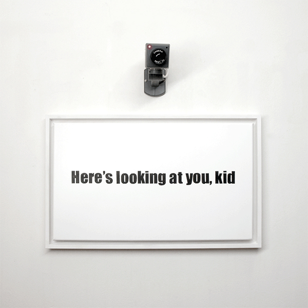
One of the projects, which is called “Here’s Looking at You, Kid” is showing quite a mysterious theme. What was the concept of the installation?
First of all, and most obviously the famous Casablanca film scene with Humphrey Bogart and Ingrid Bergman, but also the films theme in general that reminds me a lot of today’s humanitarian disasters. And, on the other hand, the omnipresence of surveillance in everyday life. When you perceive it somehow mysterious, this is actually all I wanted to evoke, and that’s why I think this work doesn’t need any more extra explanation (smiles).
What are the materials that you prefer to use for your installations?
Usually, vinyl letters and acrylics, but I also use plaster, cardboard, as mentioned before cameras, anything that I can get my hands on easily and that I need to convey the message that I intended. Most important to me is the role the letters play. Ideally, they become the main characters, they perform, come and go, fly or fall etc.
In your installations we can also see that you are trying to capture the attention in today’s public issues. Are there any themes that you like to use as an influence for your projects?
Many people don’t believe me when I say that the idea always comes from the word first and not from the theme. But it is indeed that way. First, there is always the word (smiles), then comes, most importantly, the idea and then the execution. But in general, and that insight was quite shocking when I first had it, my main themes in the past years revolve around the passing of time, perishability and death.
Is there a particular project that you are working at the moment and maybe you could share it with our readers?
I’m currently working on several artists’ books ideas. For example, I have this ongoing typewriter book project called anachronism, that keeps me steadily busy. It is a continuous project where every single poem is individually typed with one of my typewriters and the content always varies from book to book. In the newest edition, the book is bound in beautiful white cloth and each cover has a different typewriter pattern on its front, meaning no two books are the same.
You can find Anatol Knotek’s art here:
http://anatolknotek.tumblr.com
http://www.instagram.com/anatolknotek/

